

My Roll
______
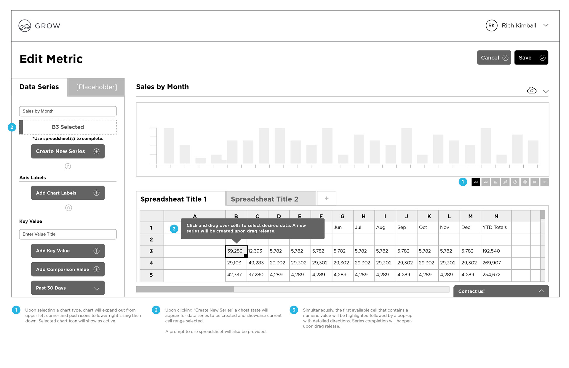
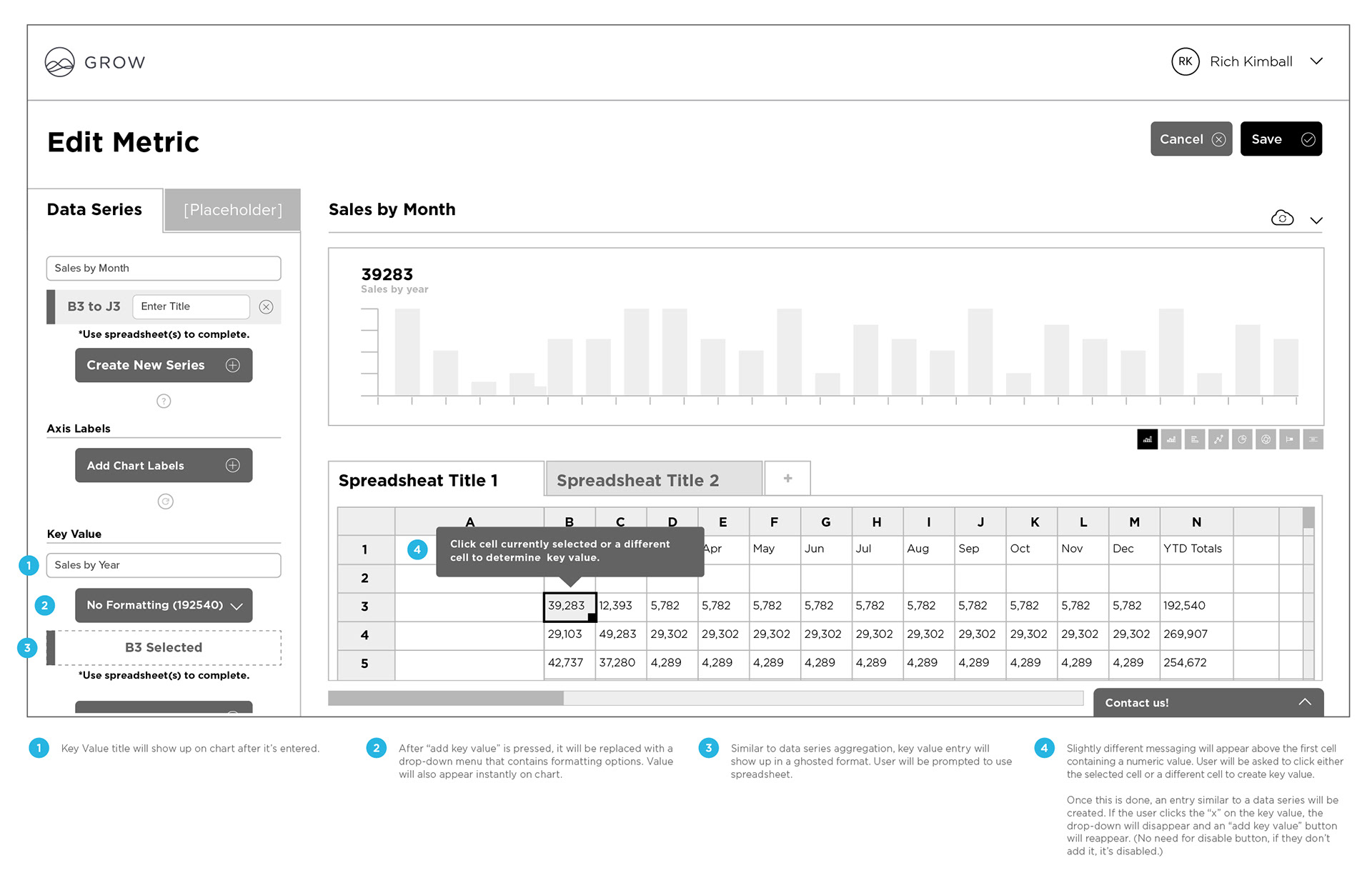
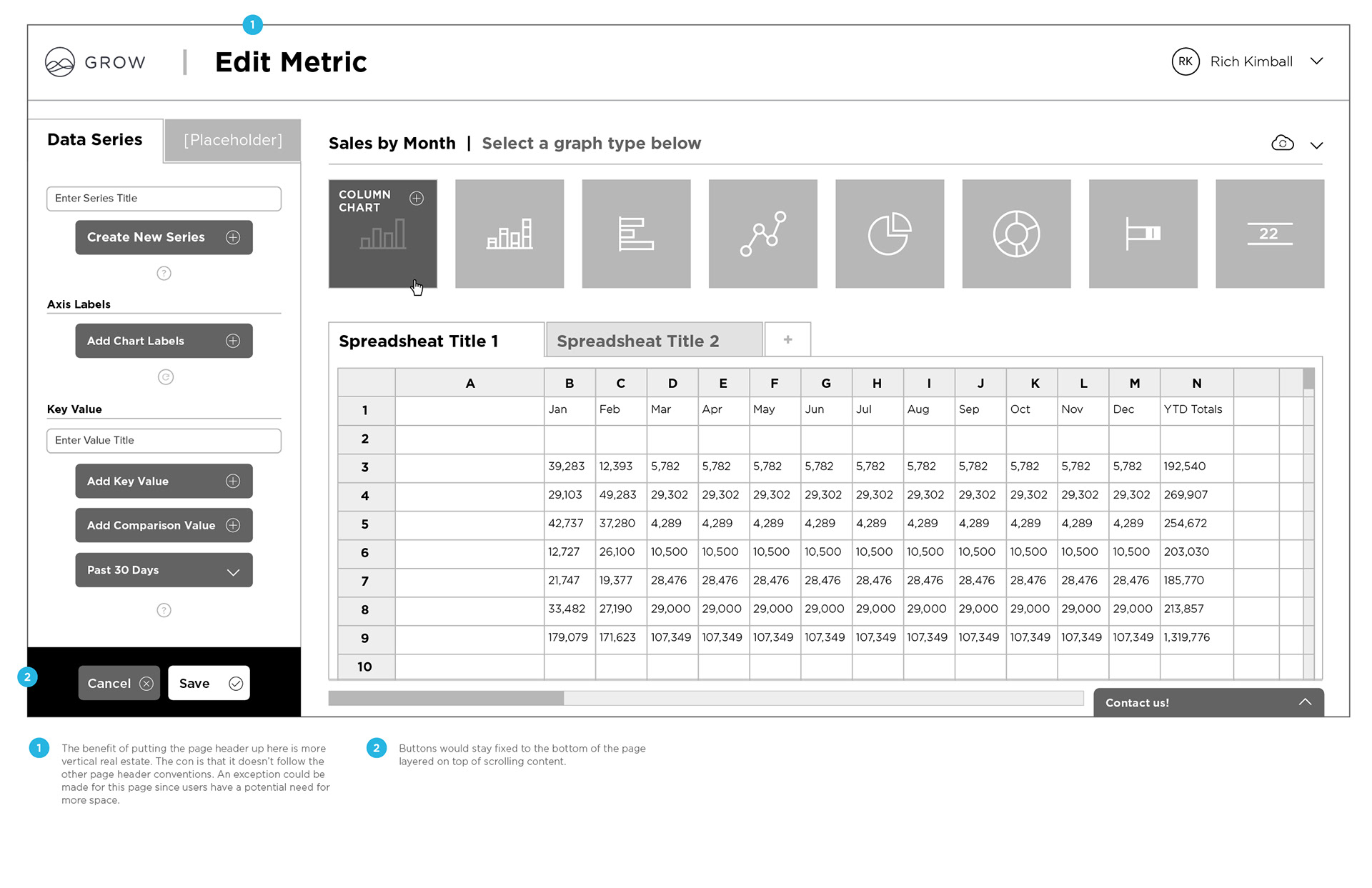
I worked as Head of Design for Grow.com managing UX/UI and Market design. I reported to their VP of product, CTO and CEO. Together, we developed the best data visualization tools for market value. While working as creative director I helped develope a new UX for Grow dashboards and built several new features so that other companies could easily create metrics needed to make quick and informed decisions about their business.
I helped create a culture that fosters fun, learning, creativity and relentless focus on building a great product and company collectively. I even exercised my videography and photography skills. Eventually Grow grew and we hired a director of marketing to oversee market related design and I focussed most of my time on UI and UX. I was roughly the 15th hire and there were up to 90 employees at my time of leaving Grow.com.
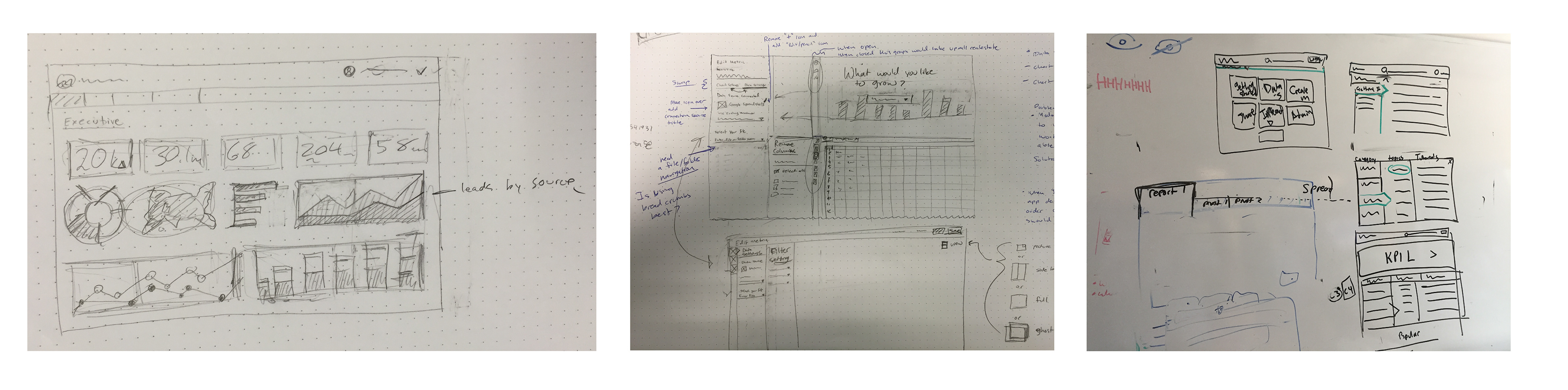

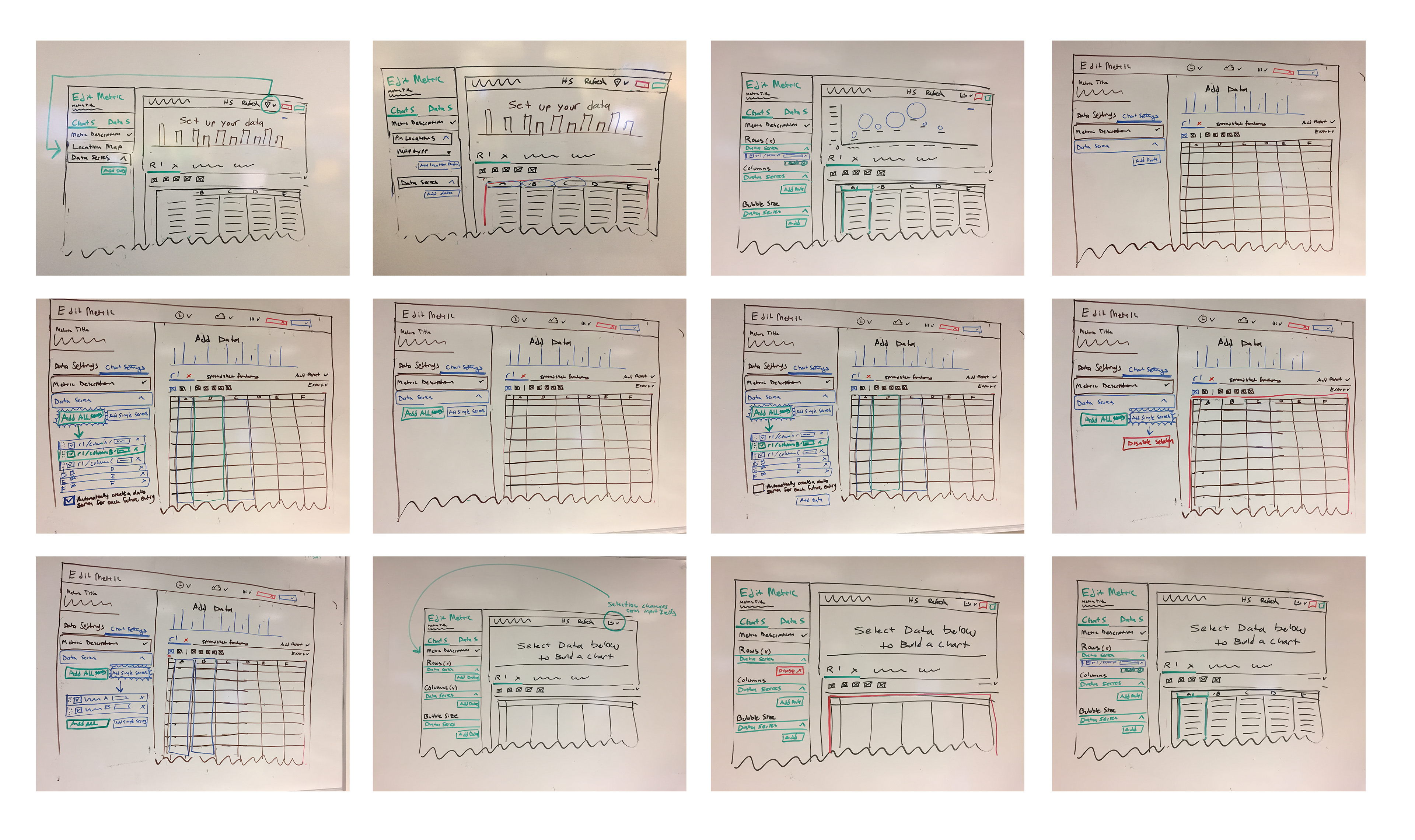
Experience Planning
______
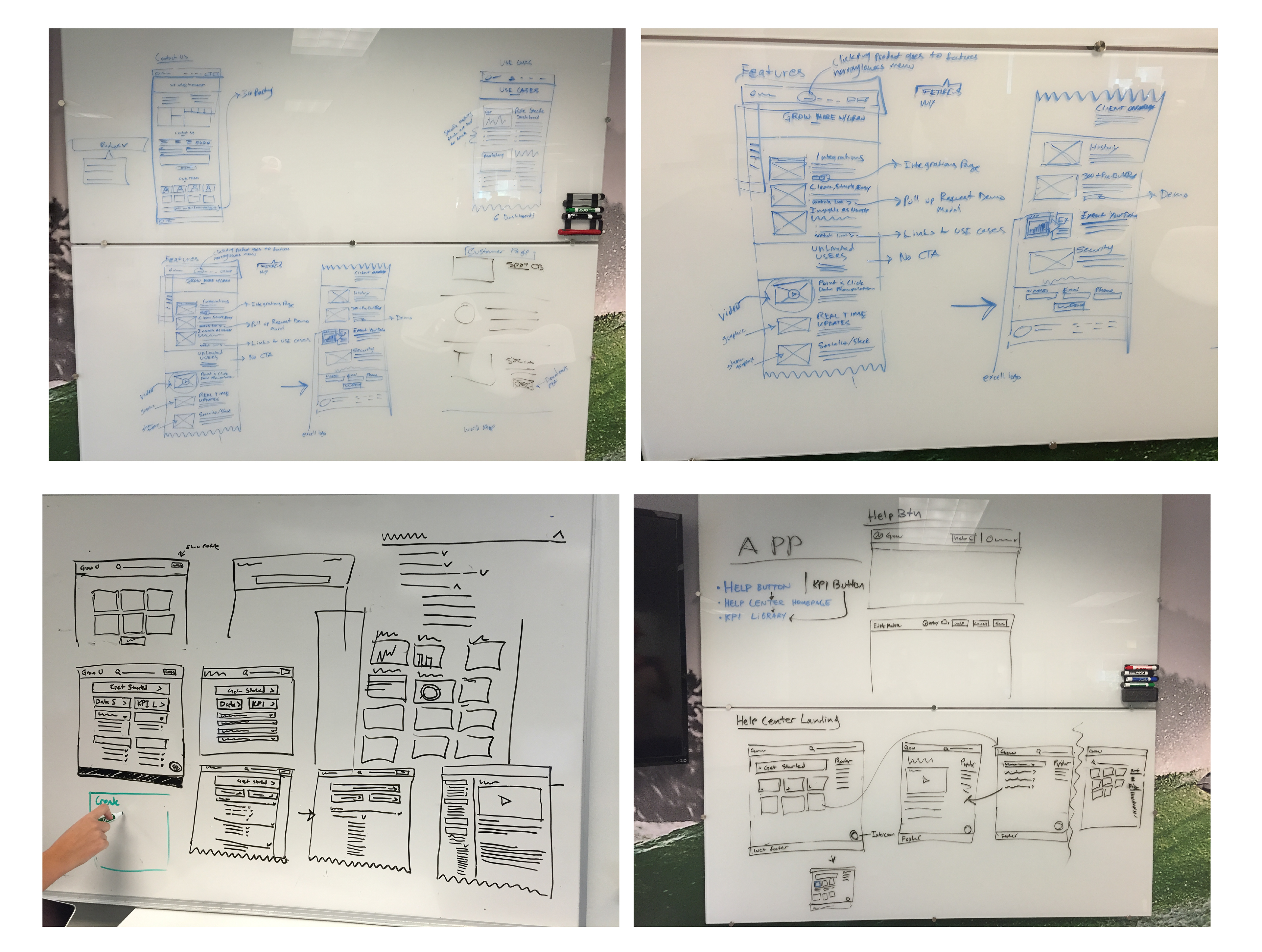
Once wireframes were created, discussed and tested, I created hi-fidelity mocks and built an InVision prototype. I tested this prototype using https://validately.com. This tool can be very helpful when you are executing moderated tests with remote users. I tested with several of our existing users. For mass testing, I would recommend https://www.usertesting.com which I typically use for most other projects.


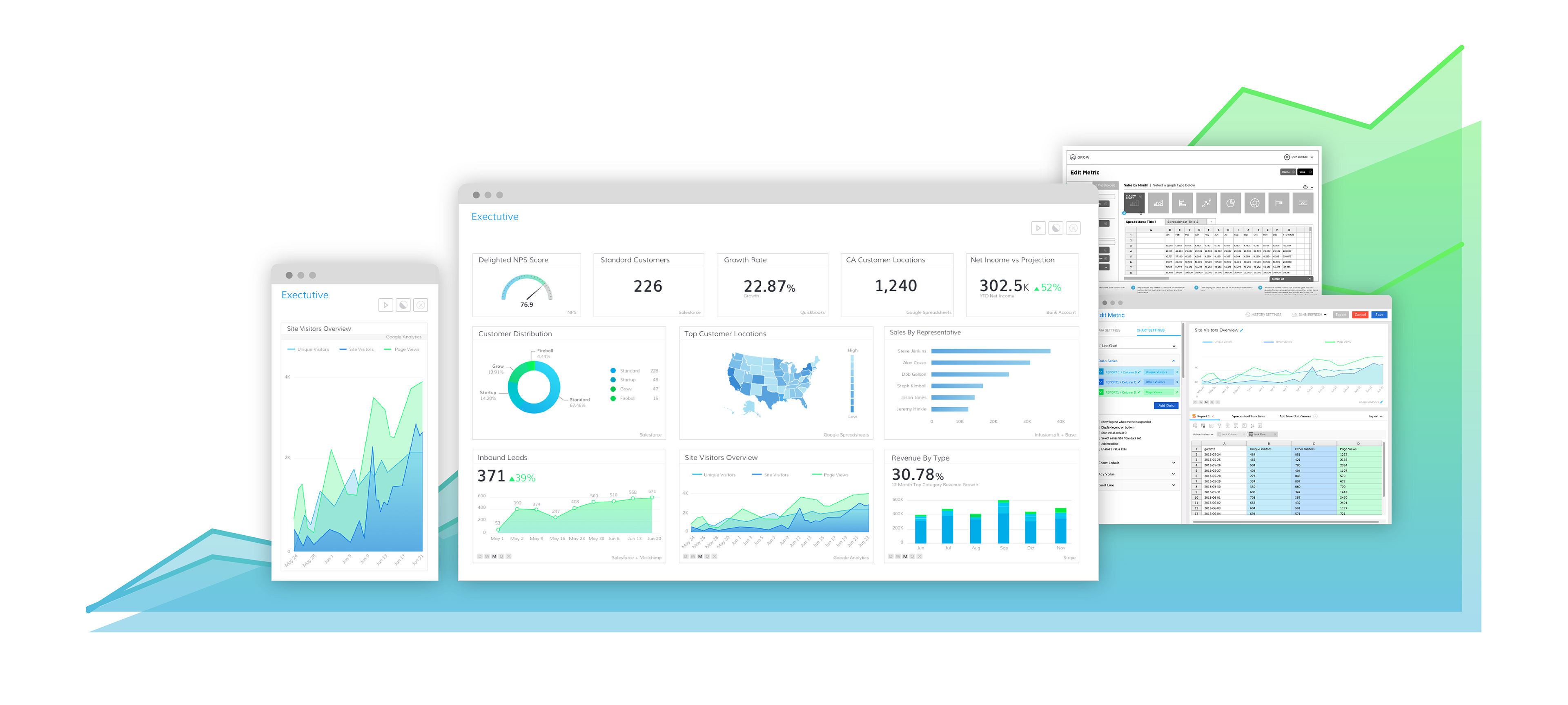
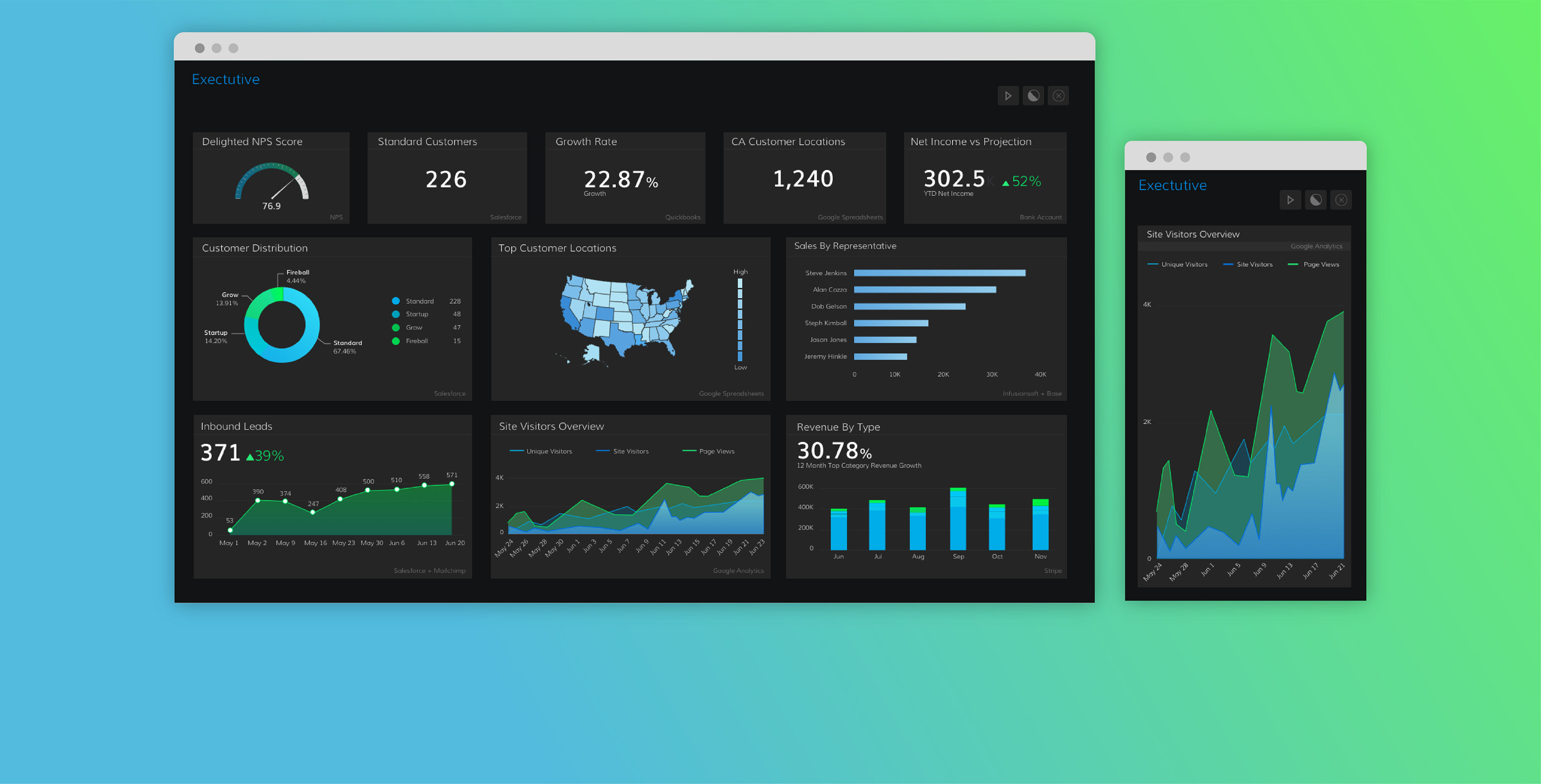
Design System
______
As part of updating the tool kit and metric dashboard UI, I created an intricate design system using Sketch App which consisted of a symbol library, a unique color palette and their numeric values, typography rules and use cases, a detailed spacing guide for metric display, interaction guides and rules. This system is and has been used to keep feature updates consistent with the rest of the UI and to aid the development process.
Grow.com
______
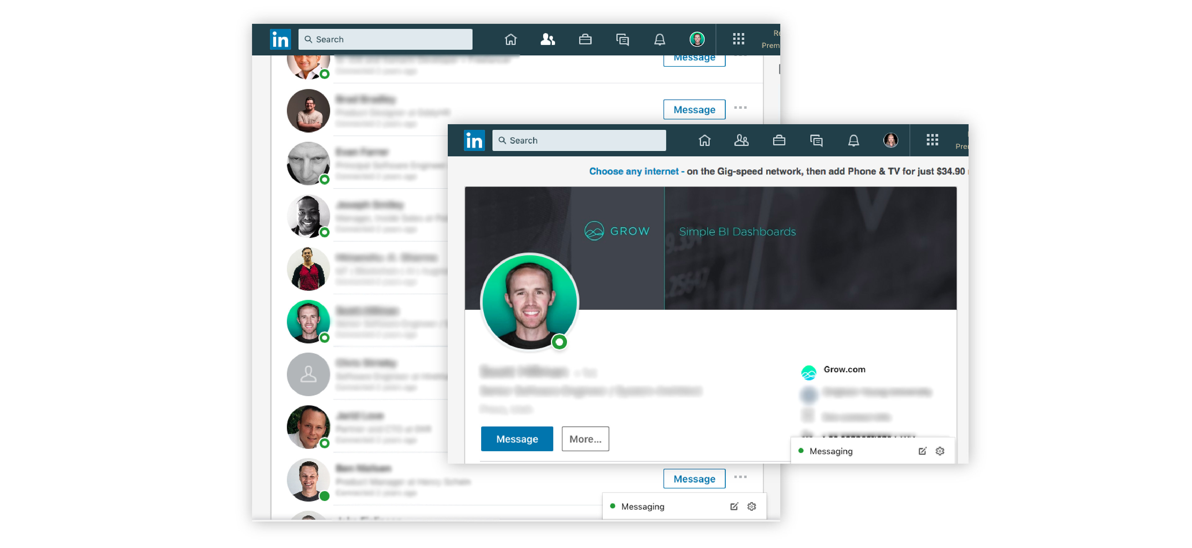
I worked closely with CEO, Rob Nelson to develop wireframes for Grow.com. Together, we developed the general flow of the site and later I created hi-fidelity mocks that would serve as a catalyst for EKR who we contracted to help us speed up the production efforts on the site. I worked with Rob and EKR's team to help guide production quality. Ultimately, Grow's marketing team finished off the site shortly after I left. It's fun for me to see my influence shine through the completed site.
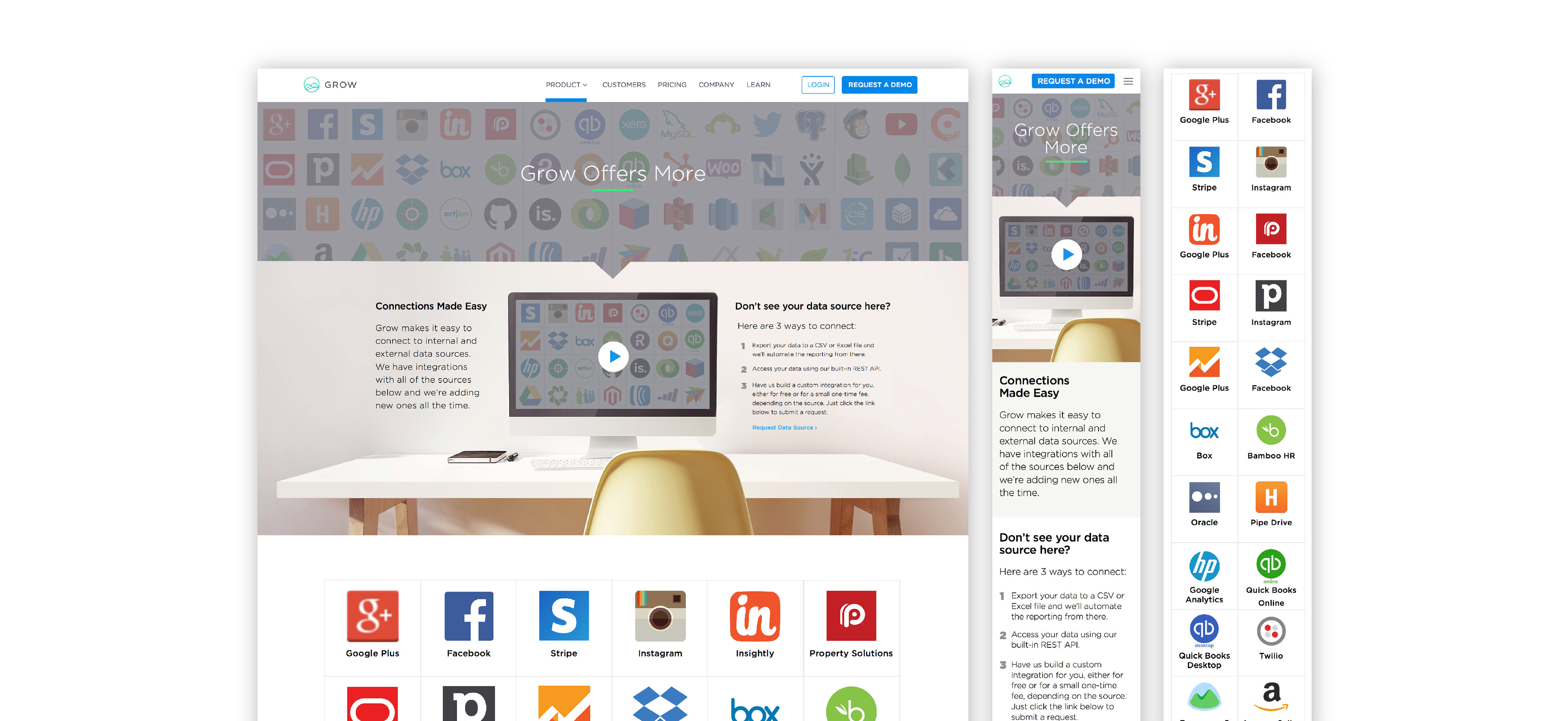
Iconography
______
I created several icons that in the end didn't really go together. I scrapped those and Rob and I decided to go with a linear and hollow icon treatment. We were after a clean, simple and airy look that would feel friendly and inviting.

Photography
______
I was charged with employee photos. With a limited budget I wanted to create a unique look that would help our sales team really stand out on linked and their social channels while representing the Grow brand. I chose a ring light because I liked the subtle call back to the Grow logo and bright green. Early on I used a green backdrop, I've since switched to photo paper. It provides a more clean, natural look and comes in a greater variety of colors.

Grow's Office
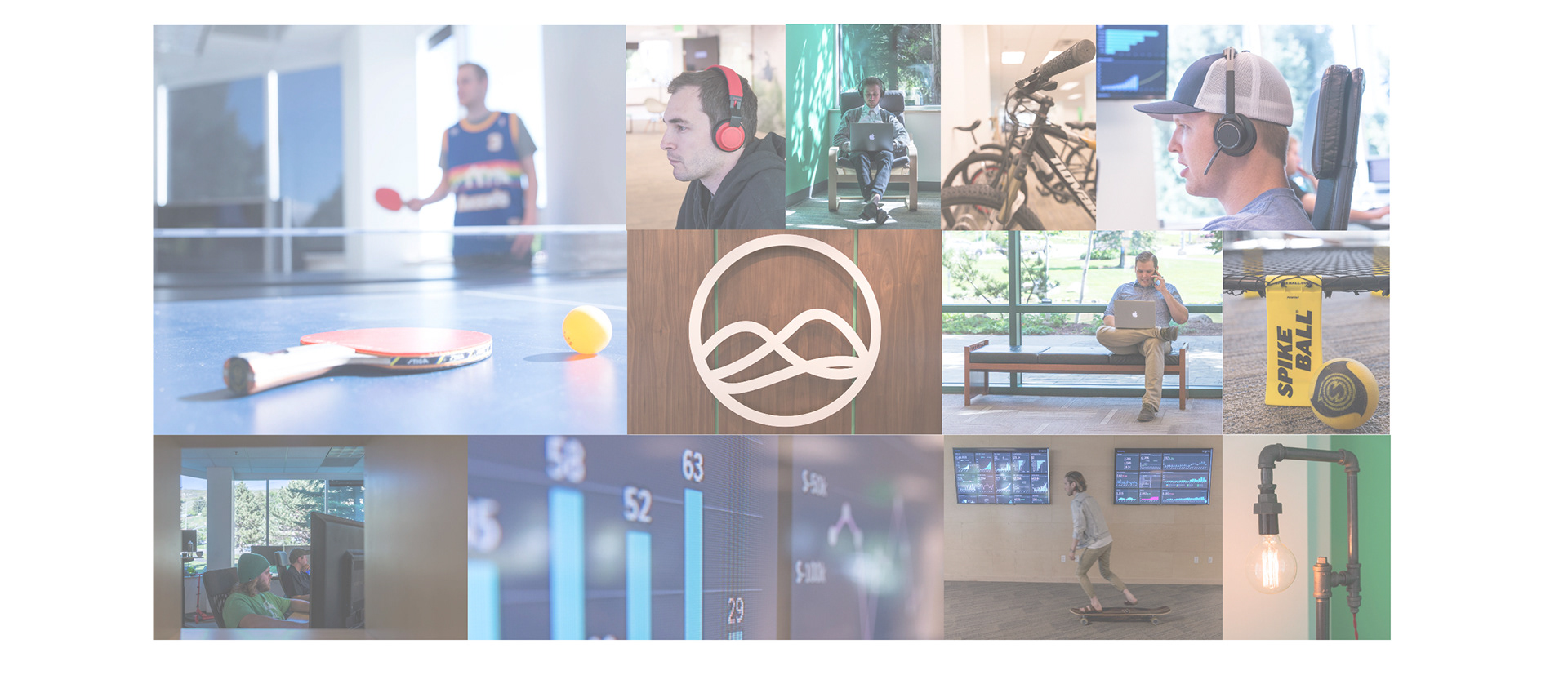
______
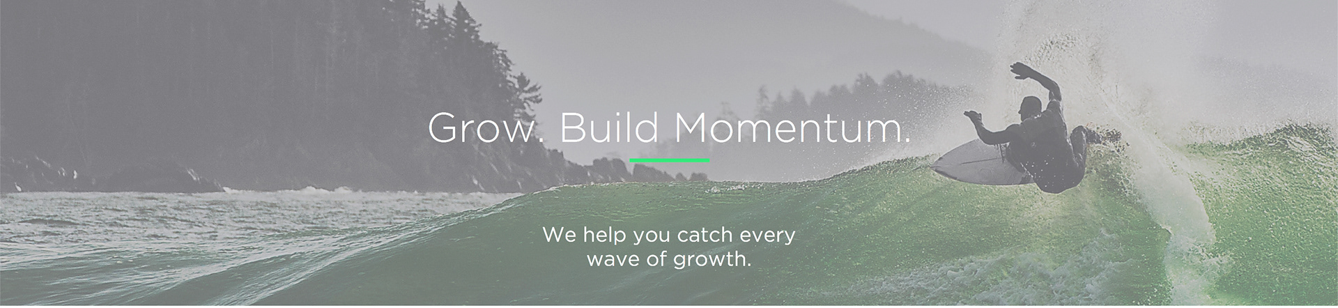
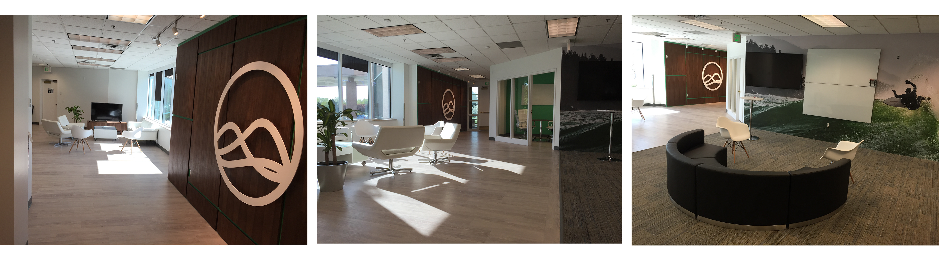
I also was asked to help design for a new space. Grow grew at a rapid pace and still is. I took building plans and desk dimensions and helped figure out an approximation for how many we could fit in the new space. I selected and ordered furniture and worked with a builder to design an entry wall. The wall consisted of a large, white, powder coated steel logo that we floated over mahogany panels next o green paint. The green and wood contrast looked great and helped the office feel less corporate and more modern. We also wrapped a wall with the image of the surfer below.
And Grow.com Continues to Grow
______
I'm grateful for the roll I played in Grow.com's continued success.